As much as we shouldn't judge a game by it's cover, it's exactly what
we do.
Sometimes the cover doesn't do justice to the game in question
and other times really appealing art work can deceive us; disguising
utter tripe with seductive typeface and alluring imagery.
Psychologically,
there are a number of things that designers do to draw us in, such as
using large identifiable faces, easy to read typeface in central
positions, etc to trick us to spend all our monies There are also
certain designers who prey on our basest instincts... ahem... *cough*
Dead Or Alive *cough*.
Ultimately,
most box art sticks to a particular formula: title plus main
character/s plus a logo. Sometimes this works perfectly and establishes a
unique brand image, take for example the
GTA franchise:
Rockstar
know how to draw in an audience by keeping their titles bold, centered
and stylised. A range of colourful eye catching imagery shows off what
the player is likely to encounter during the game; cars, helicopters,
gangs, women and action.
Other times, this "formula" can be tedious especially when sequels follow the same pattern as the original, such as the
Call Of Duty franchise, the
only change from one sequel to the next is the number of the title and a
range in hue from sandy brown to muddy brown.
Still, Activision are
doing something right as it's still one of the most popular game
franchises – I'm sure the game engine, storylines and addictive gameplay
have nothing to do with it.
Interesting, eye catching art work can lead to us choosing a game we
might not have necessarily chosen, conversely dull covers or uninspiring
box art might cause us to miss out on a gem.
Think of all the people
who pass by the
Final Fantasy series because the covers are so minimal (although arguably, very beautiful).
Fools!
Some games constantly evolve with the times, like the
Super Mario Bros. franchise
(unlike the series itself) which has changed dramatically throughout
the years. From a pixelated Mario shooting blocks to the sprawling
colourful chaos of
New Super Mario Bros. 2
Wait.. scratch that. That's actually Nintendo's modus
operandi all over... take the same thing, add more colour and just
polish it up a bit.
With this in mind, here's some
covers that have stood out throughout the years, whether its championing
a title or leading us astray:
The Legend of Zelda series set a precedent for all RPG
titles to have simplistic, clean designs which work so well. The first
incarnation was a simple shield featuring a lion, a heart container and a
key. This was back when box art gave very little away about the game
itself. Despite the success of
The Legend of Zelda on the NES, I'd argue that
The Legend of Zelda: A Link To The Past for the SNES possesses the most renowned box art of the franchise:
It
retained the majestic gold background of the original but updated the
shield to incorporate the Triforce, which is central to all
Zelda
games, it also added Link's sword latticed between the Z of Zelda, this
is something which has continued over 20 years later and the fact that
the typeface has barely changed throughout the years is a testament to
just how iconic this cover is.
Doom
is the ultimate bad-ass cover, it's striking, incredibly cool
over-the-top nature is very reminiscent of 80's action flicks. And like
most film posters of that era, this compeltely misrepresents the
gameplay but captures its essence. To explain, the cover details
countless red hell beast things that could be interpretted as the Red
Pig Demons and The Imps but they're a bit non-descript. Then there's the
fact there are two space marines! I don't remember any friendly dude
helping me fight the horde. I remember shooting a lot of dudes. Crap...
maybe one of them was on my side. Sorry wavy guy. You will be missed.
Final Fantasy covers often
get criticised for being 'boring' but I adore them for their simplicity
and elegance. Possibly the most stunning of the franchise is FFVI, the
box art on the SNES version of this game is intricate, stylish and
intriguing whereas the updated Playstation version is closer to its more
recent incarnations. Only Squaresoft could take the absence of colour
and turn it into a unique selling point and interesting design feature.
As iconic as The Beatles White Album? Maybe.
![]()
The European edition of
Ico is
absolutely stunning and I have no idea why the cover was changed for
the US version because it surpasses in every way. The game is often
thought of as a work of art as opposed to a game but in my opinion the
two can often go hand in hand - much like the young protagonists in the
game.
Red Dead Redemption is
the perfect amalgamation of Western cinema and storytelling so the
cover needs to reflect that. Bright, bold and stylised the cover retains
the familiar Rockstar traits while still evoking that requisite period
feel. The additional expansion release,
Undead Nightmare is a pastiche of the original cover with a unique zombie twist and it works beautifully.
Speaking of the 'Z' word, Valve's zombie killing franchise
Left 4 Dead stands
out from conventional game covers due to its lack of the usual single
protagonist. Yet, Valve decided that showing all four characters would
make the cover overly crowded so the design team adopted a more
interesting approach. By showing off the gnawed, decaying hand of the
games main antagonist, players may not instantly know what type of game
to expect but the eye-catching, flashy and visceral images are just too
glorious to pass by.
![]() Left 4 Dead
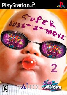
Left 4 Dead proves that sometimes putting a main character centre stage on the cover isn't necessary, much like
Super Bust-A-Move 2 (or as I like to call it,
Super-Creepy-Babyface-In-Shades 2)
is one of those bizarre covers that sticks with you whether you've
played it or not.
Despite the fact that it's a simple puzzle game with
no babies, no busting of moves... fine, I bought it for novelty value.
It does however go to show that the weirder the cover, the more
memorable it can be.
The same can be said of
Katamari Damacy which
has a cover unlike most conventional games.
Considering the game itself
came about from a school project, the box art resembles something an
artsy graphic design student might come up when presented with the
design brief: 'Create an ad for an environmental concern campaign'.
![]()
This
style gives it a uniqueness which other game covers lack. As a piece of
art, I imagine it would look great in a lofty apartment or quirky
coffee shop somewhere.
This game might not be one that all gamers will
want to play but the cover will certainly intrigue them whether they
like the tween sugar-coated design or simply want to know what the hell
it's about! Judging from the cover, if I didn't know the
Katamari series I'd guess it was about two cows on a magical journey to a junkyard in Japan. What? I said it was a guess.
If ridiculous images are then perhaps
the most hilarious video game box art ever is
Phalanx.
The Hyper-Speed Shoot-Out In Space as it's described on the box appears
to involve a hillbilly Santa on his day off playing a banjo on his day
off! Maybe the in-game music is reminiscent of a banjo?
Nope. Not at
all... When I first saw this cover, I thought it was fake. Interestingly
and rather alarmingly, no one at Nintendo thought to question its
relevance back then.
These days a misleading cover could get a company into trouble for false advertising.
Space shoot-out... pfft.
I
wish this games protagonist was a hillbilly armed with a banjo in space!
It practically sells itself.
I
could happily ramble on about almost every single cover ever released
but I'm already well over my word count and I'm sure I'd still miss of
plenty of gems, so by all means voice your thoughts in the comments
section below and if you can find a copy, go buy
Phalanx,
throw away the game, and frame the cover in your home.
Be the envy of
all your friends.
In fact, be like banjo man, just look into his eyes.
This guy is the embodiment of cool.
![]()
![]()
![]()